
A Powder Room Fit for an Estate
Reimagining a Piece of Greenbrier History
Some projects are about a room. This one was about a legacy.
When Brian Ooten came to us about redesigning the powder room at his family's estate in Oregon City, Oregon, it would have been easy to treat it like any other small-space refresh — pick a wallpaper, choose a paint color, done in a season. But Greenbrier Estate isn't just a house, and this powder room isn't just a room. It's a thread running through six decades of a family's story, and we wanted the design to feel worthy of that.
A House Built on History
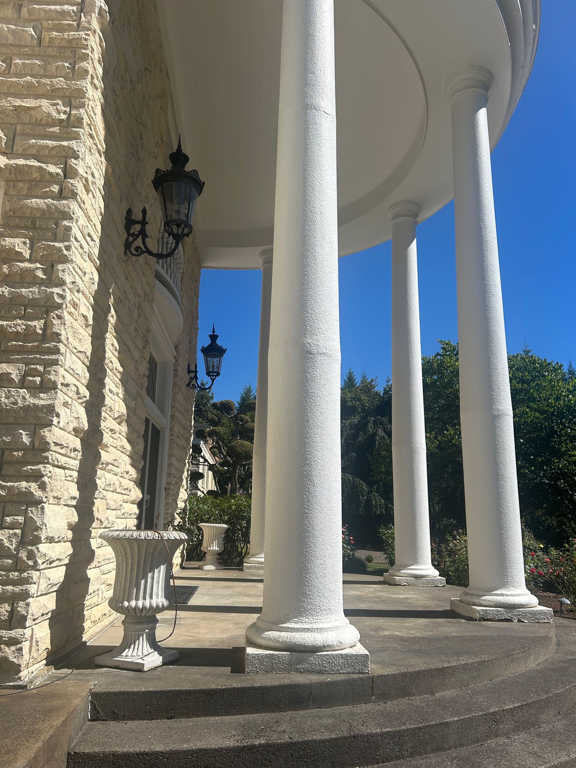
Greenbrier Estate was built in 1968, its architecture drawing inspiration from the Sumner Mansion and the Greenbrier Resort — grand, gracious, Italianate references you can still feel in the home's proportions and detailing today. It was originally owned by Brian's parents. His mother was the daughter of the inventor of Corningware, and the estate she and her husband built became a gathering place for politicians and celebrities, hosting the kind of lavish parties that leave a house with stories in its walls.
At its peak, the property spanned 320 acres. Today it's 80 — still substantial, still commanding, but a fraction of its original footprint. What makes this project especially meaningful is what happened next: Brian bought the family estate back. After years away from it, he returned to the home his parents built, and began the work of bringing it back to life, one room at a time.
The powder room was one of the first spaces we tackled together.
The Brief: Feminine, Italianate, and Personal
Brian's brief was clear on two fronts. First, the design needed to be feminine — soft, detailed, a little romantic — in a way that honored the home's Italianate architecture rather than fighting it. Second, it needed to reflect him. Brian has a deep love of Asian design, and his own apartment leans heavily into a Japanese aesthetic. We wanted the powder room to hold both of those things at once: a nod to the house's grand European bones, and a nod to the client living in it now.
Before we touched a single finish, the room was painted a bright, saturated pink — bold, but too intense for the delicate architectural detailing surrounding it. It was fighting the house instead of complementing it. We also knew from the start that whatever we did, we wanted to preserve the details that made the room unmistakably this house: the original flowered light switch covers stayed exactly where they were, untouched, a small but deliberate thread connecting the new design back to the old.
Finding the Wallpaper
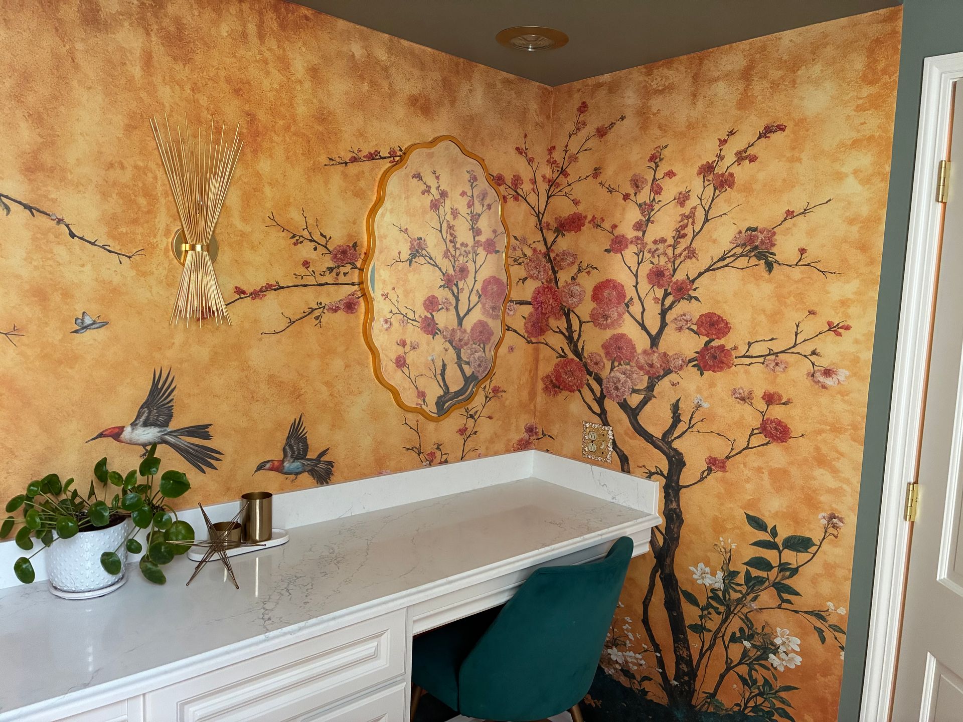
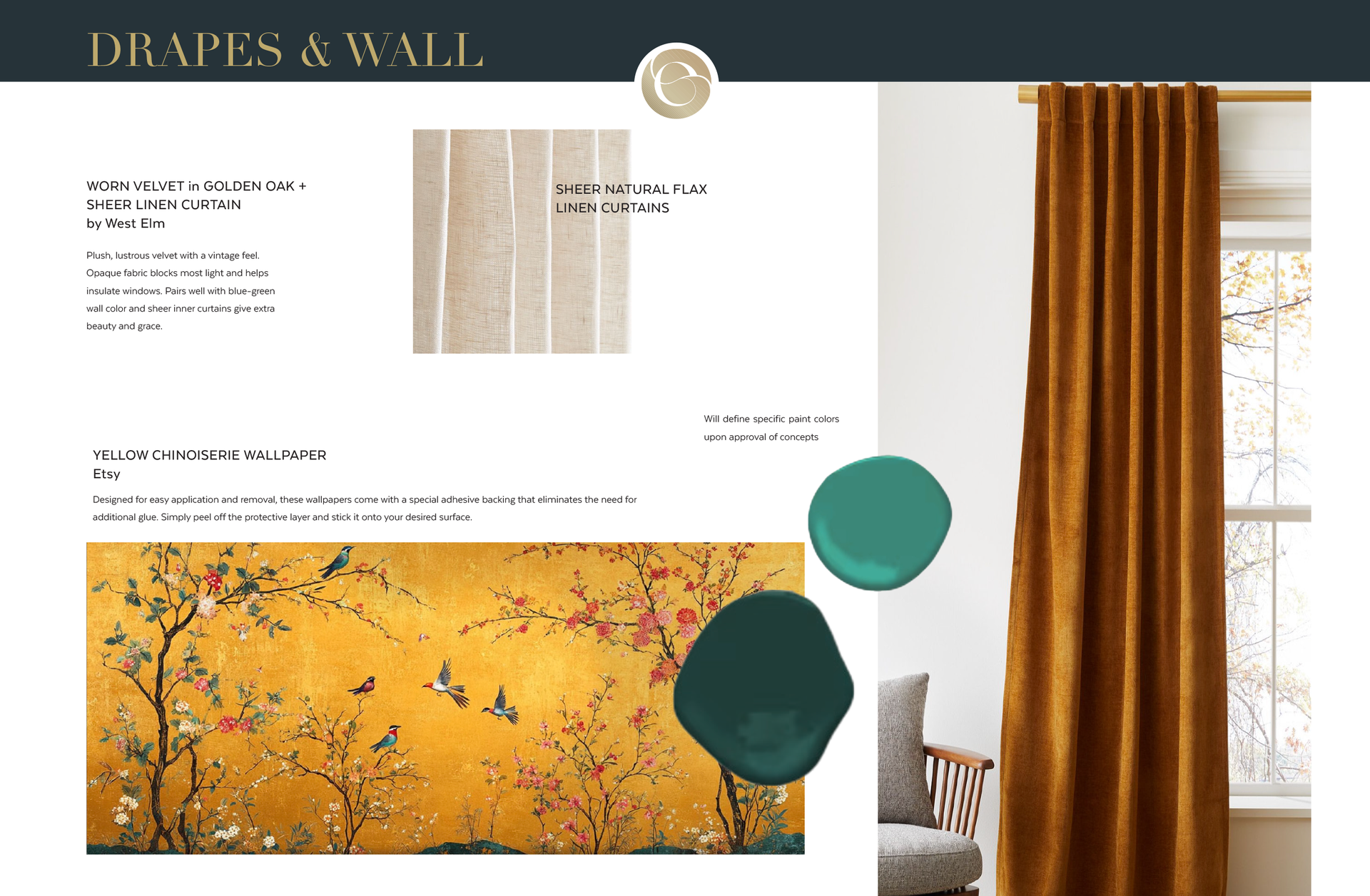
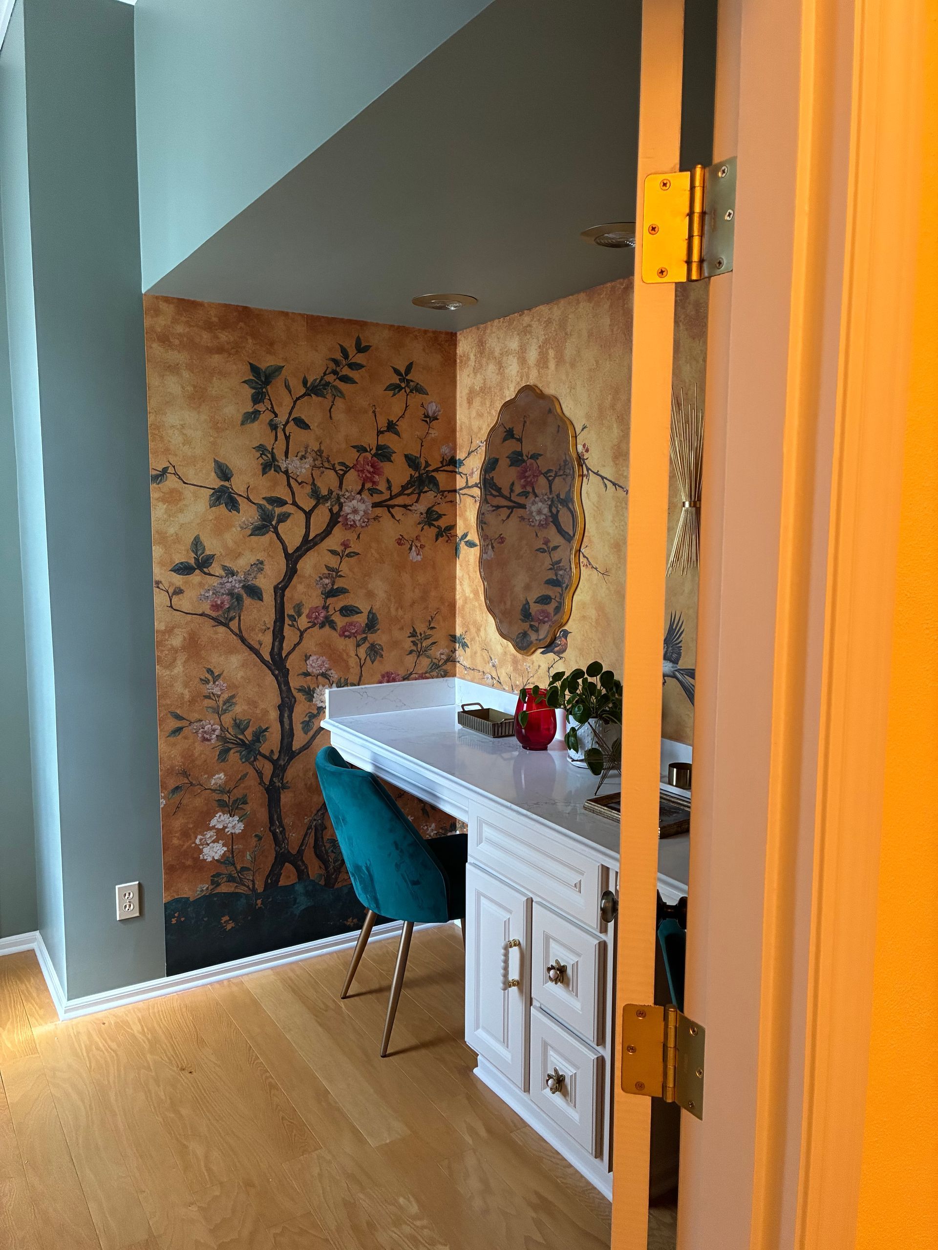
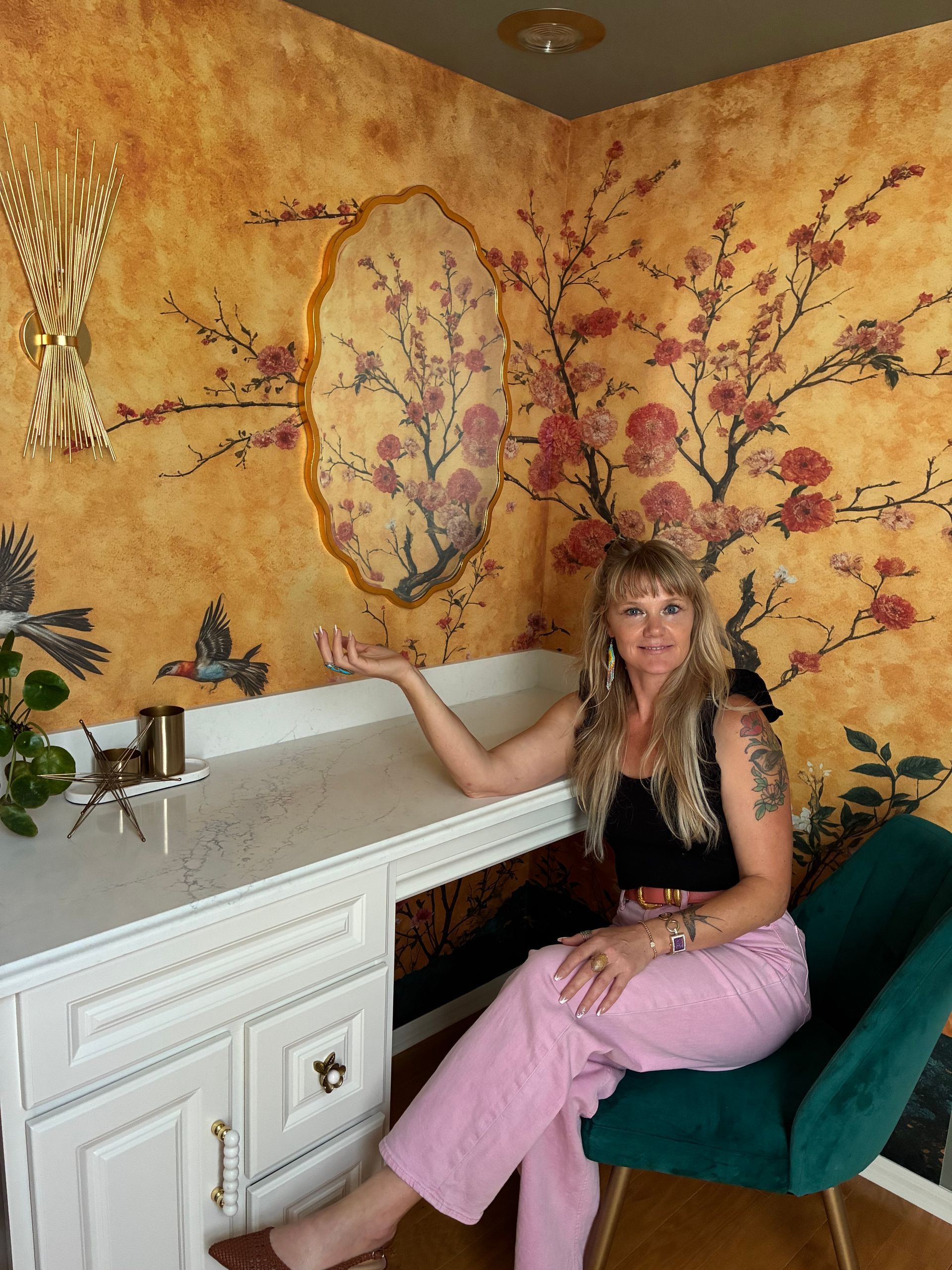
The design turned on one decision: the wallpaper. We landed on a chinoiserie pattern — birds in flight, branches heavy with blossoms, rendered in warm, gilded tones — sourced from Cherry Wallpaper on Etsy. It was the perfect bridge between the brief's two halves: chinoiserie is, at its root, a Western reinterpretation of Asian motifs, which meant it could speak to Brian's love of Asian design while still feeling entirely at home in an Italianate powder room.
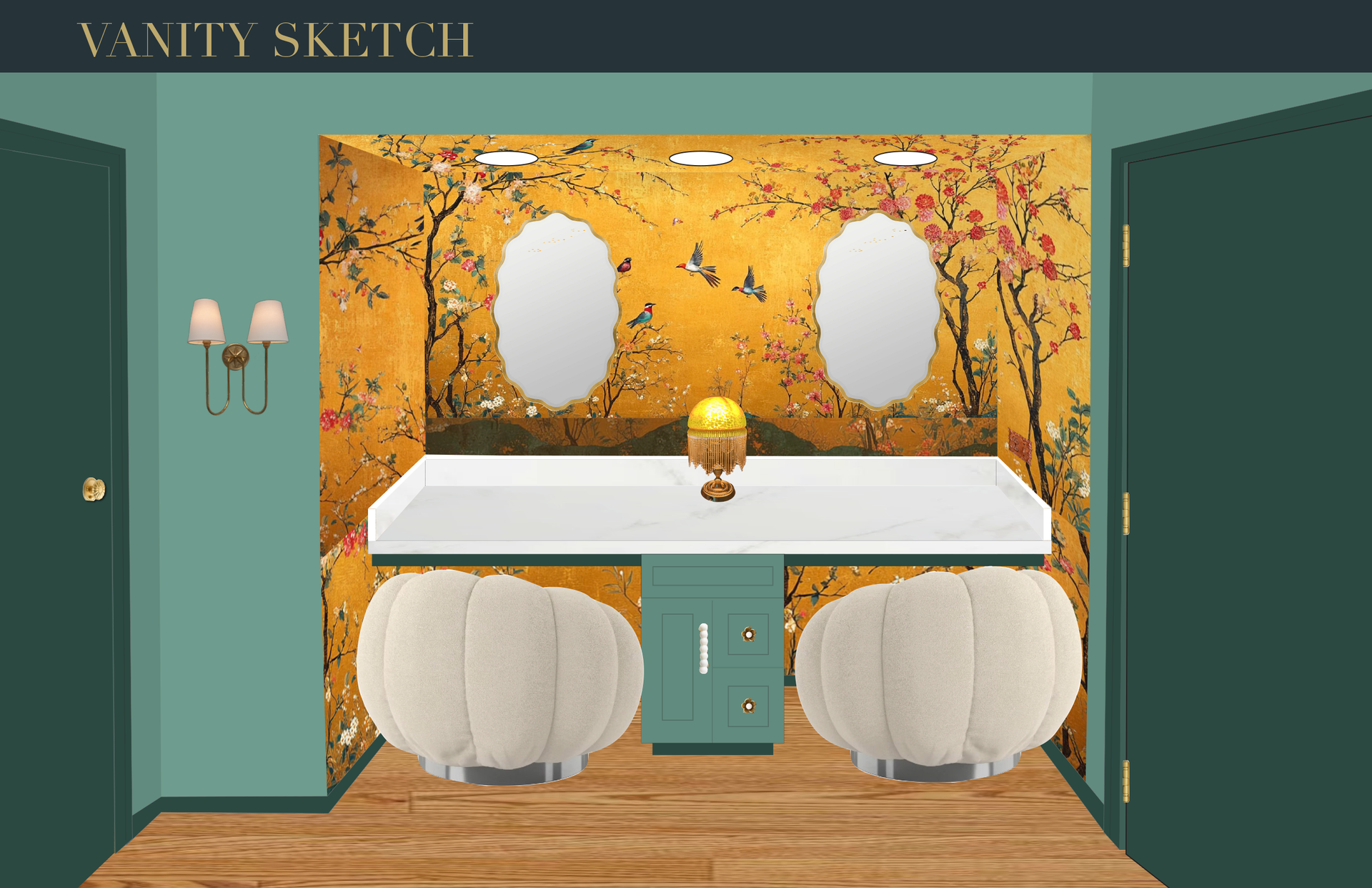
The challenge was that this powder room is an inset space — irregular, tucked in, not built to standard proportions. Off-the-shelf wallpaper wasn't going to work. So we worked directly with the maker at Cherry Wallpaper to have the pattern custom-sized specifically for this room, panel by panel, so the birds and branches would land exactly where we wanted them, wrapping the walls and ceiling as one continuous scene rather than a repeating pattern that happened to fit.
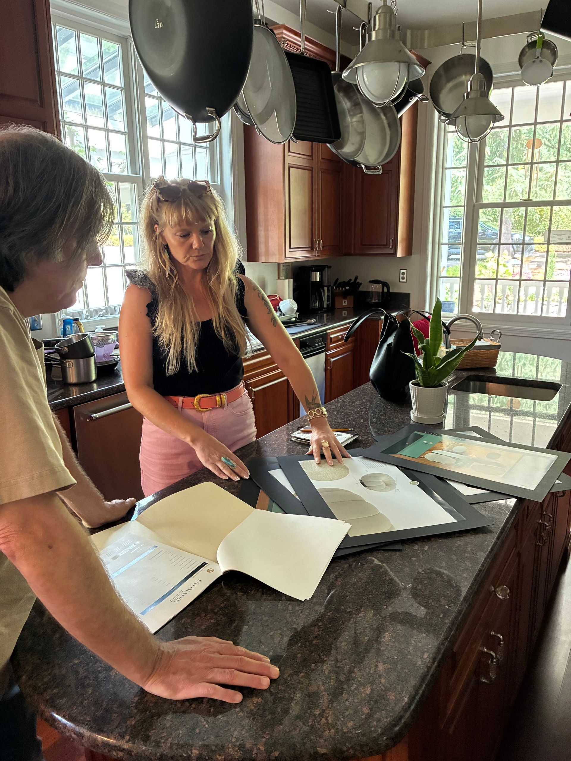
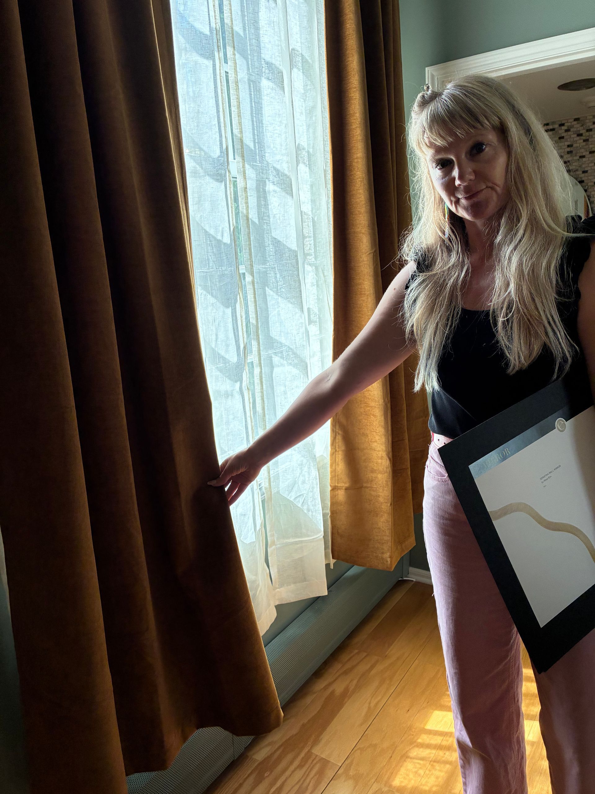
To get there, we didn't just talk through swatches over email. We hand-drew Illustrator mockups of the space, printed them large, and mounted them to mat board — then brought them to the estate in person to walk Brian through the vision on-site, standing in the actual room the design would live in. It's a slower way to work, but for a room with this much history, it felt like the right one.
The Palette
Around the wallpaper, we built a quiet, considered palette. The walls went to Farrow & Ball's Card Room Green — a deep, grounding tone that lets the gilded wallpaper glow instead of compete. Trim came in Shoji White, crisp against the green without going stark. We upgraded the original wall hooks to a simple gold finish, a small material change that ties back into the warmth of the wallpaper's palette.
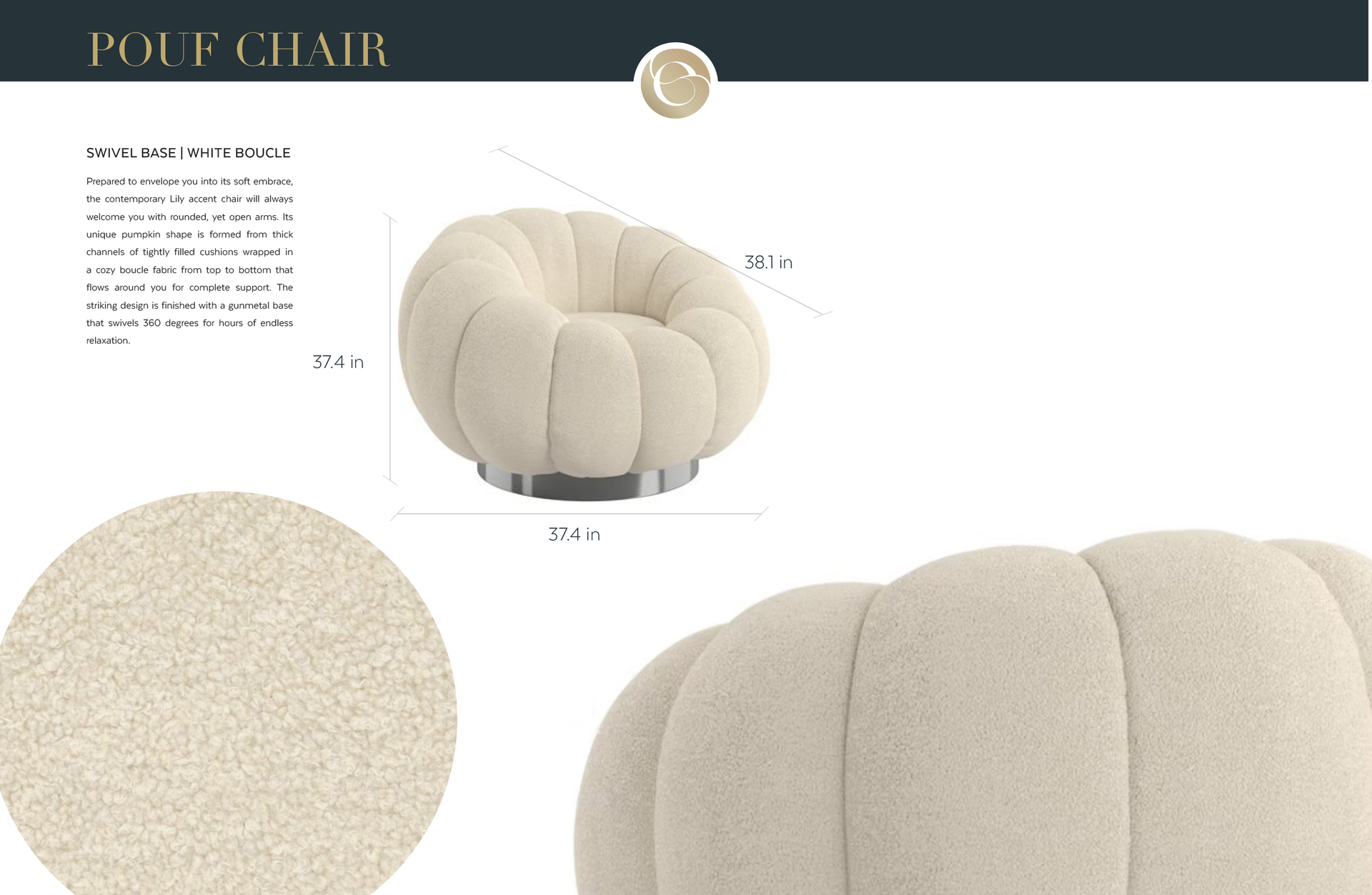
Even the seating had its own story. Our original chair selection for the space ended up sitting too low for the room's proportions once everything else was in place — so we swapped in a pair of our own personal chairs instead, a decision made on instinct once we could see the finished room taking shape rather than on paper.
All of it came together on-site with builder and wallpaper installer Greg Olson of Olson & Jones, whose craftsmanship made the custom-sized panels and detailed trim work possible.
Where It Stands Now
The room is close to finished — we're still working through the last small details, hanging artwork and styling the counter — but the bones of the transformation are complete. Where a too-bright pink once fought the architecture, the room now holds a quiet richness: gilded birds and blossoms wrapping the walls, a deep green grounding it all, and small original details like the flowered switch covers still doing their quiet work of connecting past to present.
It's easy to talk about powder rooms as low-stakes spaces — small square footage, small budget, small impact. This one reminded us why that's not always true. Every choice in this room, from the wallpaper sourcing to the paint sheen to the chairs we ultimately chose ourselves, was made in service of a bigger story: a family estate, once nearly lost, being brought back to life by the person who grew up in it.
That's the kind of project worth taking slow. And worth getting right.
Design by Epiphany / Style. Construction and installation by Greg Olson of Olson & Jones.